0%

Brand Identity

The Overview

Sipmalai is a unique dessert destination in Perumpilavu, specializing in authentic malai and premium shakes. With ambitious plans to expand across the region, the brand required a strong, scalable identity that could introduce a relatively unfamiliar product to the local market while feeling instantly approachable and crave-worthy

The Challenge:

While malai is a beloved treat in many parts of India, dedicated malai shops are a rarity in Kerala. Our initial research revealed a unique challenge: the brand needed to educate the audience and position itself not simply as another standard juice shop, but as a distinct, premium dessert experience. The identity had to be inviting enough to encourage trial while establishing a strong foundation for future franchising

The Strategy &
Visual Identity

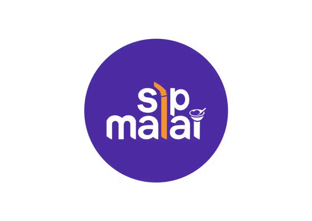
To bridge the gap between an unfamiliar product and a new audience, we took a story-driven, minimalist approach to the brand identity. The typography is deliberately soft and rounded, projecting a welcoming and accessible personality

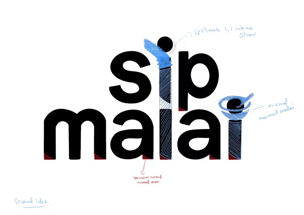
To instantly communicate the brand’s core offerings : shakes you can drink and malai you can eat

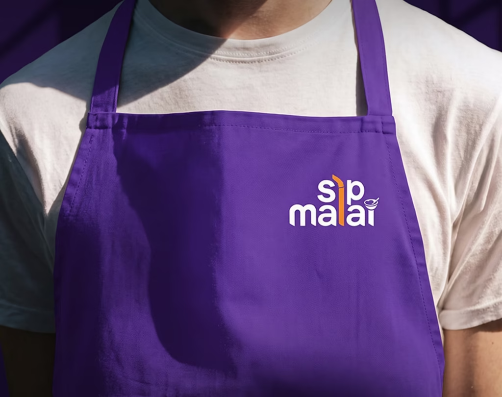
we engineered a clever typographic lockup. A vibrant orange straw forms the central pillar of the logo, seamlessly connecting the words “sip” and “malai”. Furthermore, a minimalist bowl and spoon playfully replace the dot on the ‘i’, acting as a subtle visual cue for the dessert aspect of the menu

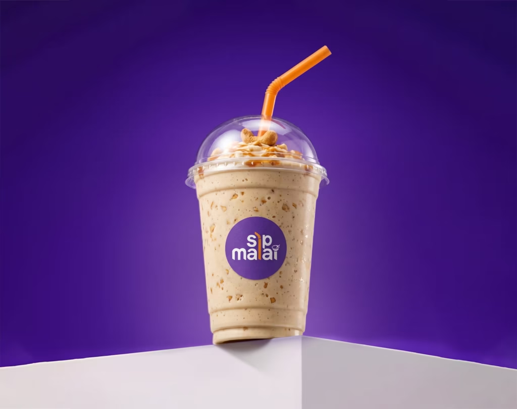
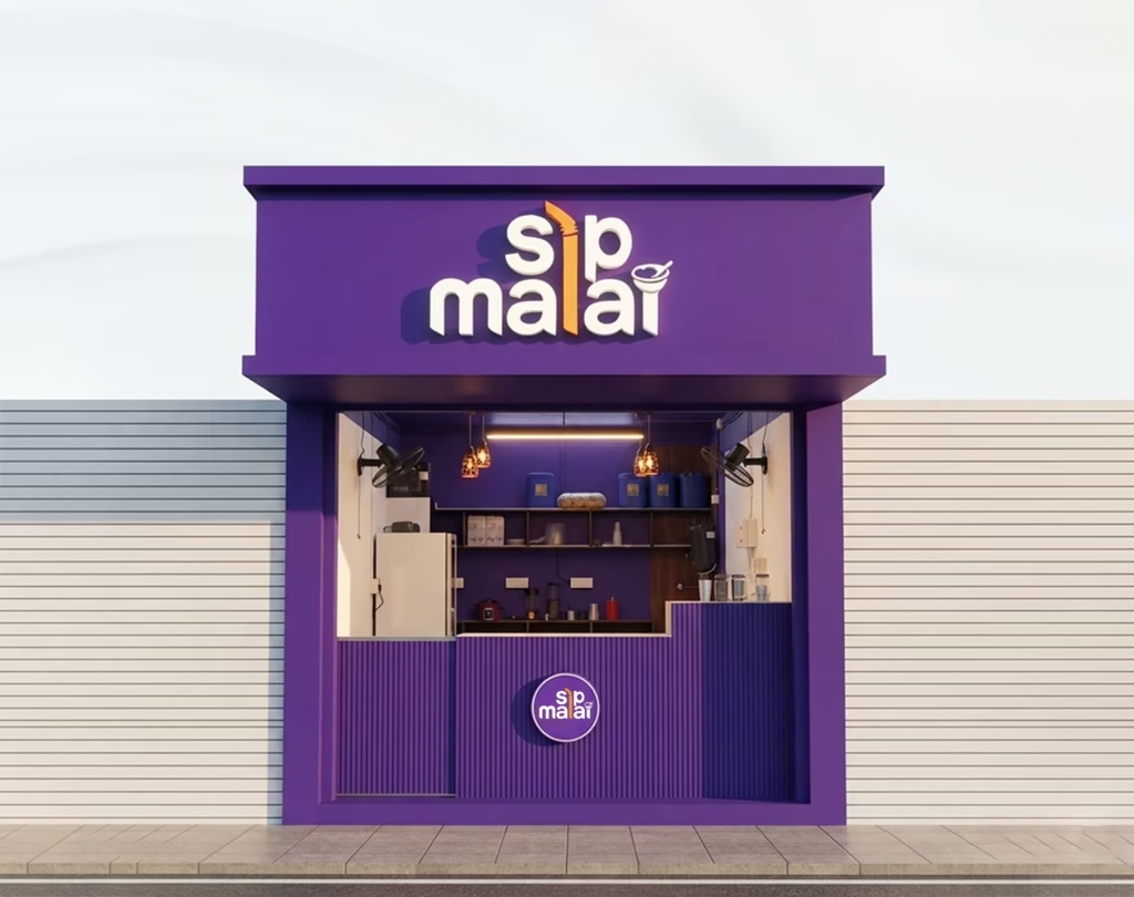
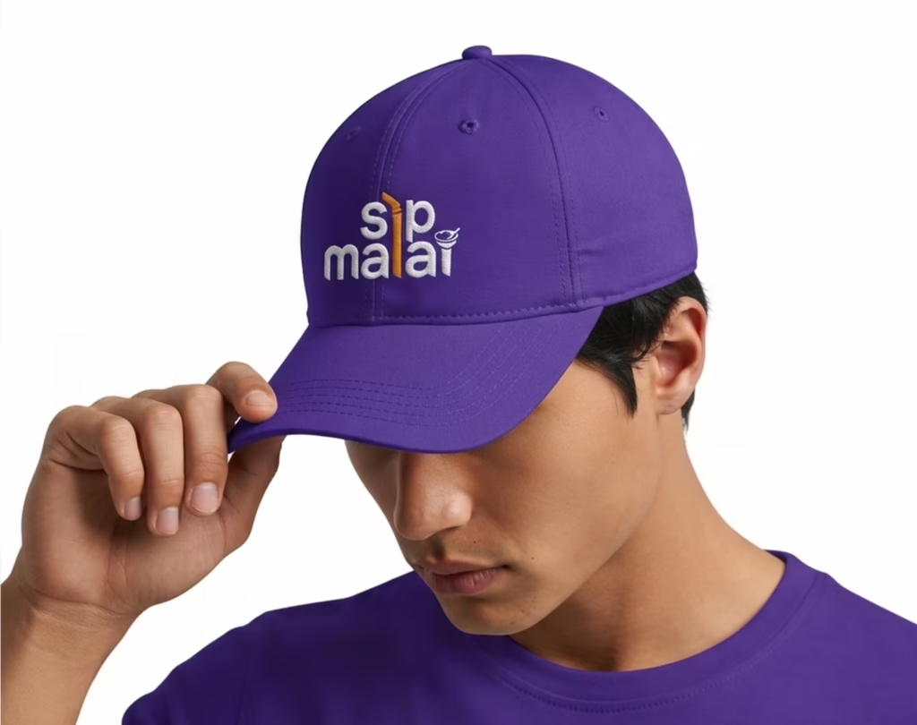
We moved away from predictable food industry colors, opting for a bold, fresh combination of deep purple and vibrant orange. This palette gives Sipmalai a highly appetizing, energetic, and premium presence that easily stands out in the bustling Perumpilavu market and across physical packaging

Motion Identity:

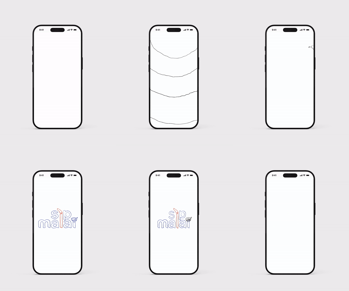
To make the Sipmalai brand truly dynamic across digital touchpoints, we developed a custom logo animation. The sequence begins with a single drop creating a fluid splash, which playfully transitions into the brand’s soft typography. The bouncy motion seamlessly brings the vibrant orange straw and the minimalist dessert bowl to life, reinforcing the brand’s dual message of “sip” and “eat”

Scroll to Top